- Solutions
Healthcare
- Resources
Revenue Management Analytics
We turn business analytics into business action.
“
VisiQuate analytics helped our hospital drive down inaccurate charges in high-end imaging, saving us over $4M/year.
– Vice President, Revenue Cycle, UTMC
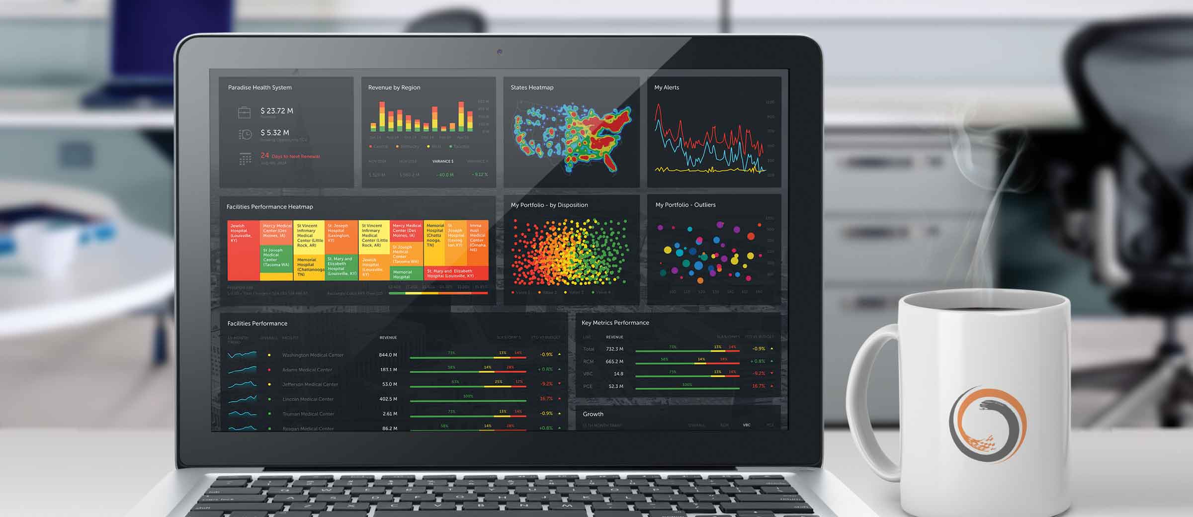
Most revenue cycle BI solutions overload you with a variety of generic dashboards and reports that over-emphasize lagging indicators like A/R Days, Bad Debt, and Charity. They are typically reporting-heavy and insight-poor. But you need much more than routine metrics that leave you wondering, “Now what?” That’s why our Revenue Management Analytics deliver information that streams value-rich intelligence. Our users see advanced visualizations of a breadth of leading indicators that span the entire revenue cycle. This leads to insights into root causes that much better enable action.
VisiQuate users access advanced metrics that map closely to their roles in the organization and lead directly into specific workflows that improve individual and organizational performance. To make our Revenue Management Analytics solution even more valuable, it also features advanced ad-hoc querying, self-service reporting, dynamic visualizations, actionable alerts, collaboration, dynamic geographic mapping, learning management tools, and much more.
Key Features & Benefits
- Advanced revenue, payment & adjustments insight
- Predictive analytics capabilities
- Anomaly & outlier pattern detection
- Root cause analysis by function by criticality
- Accelerates payer cashflow
- Optimizes staff productivity
- Self-service workflow & worklisting
- Improves systemic defects
- Improves payer negotiations, data distribution and month end reporting
Every day, we turn up the value.
In addition to transforming and integrating your data as part of our daily data service, our data engineers, SME product specialists and visual scientists are working tirelessly behind the scenes to continuously update our platform and business analytics solutions with new features, refinements and other product innovations.
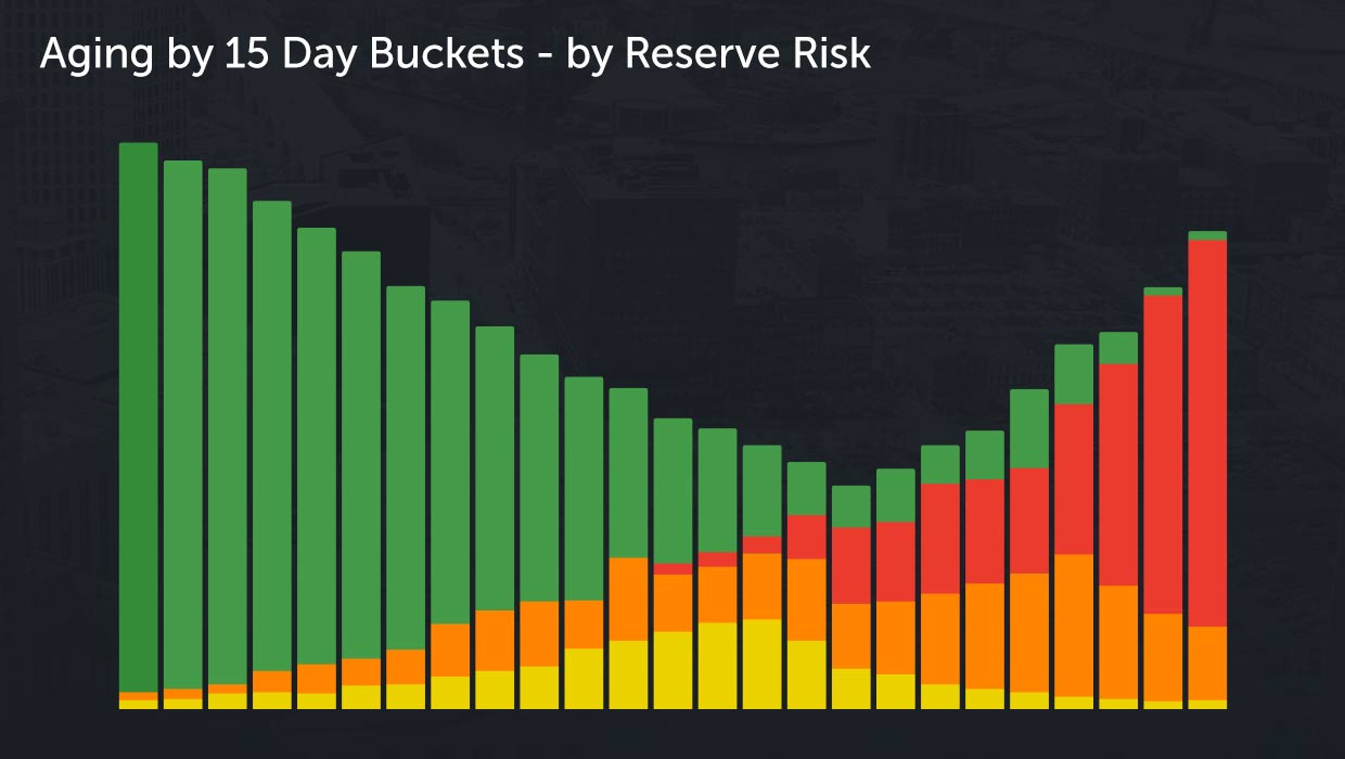
Advanced Aging Analytics
Aging is traditionally viewed in broad 30-day buckets. But VisiQuate can tailor aging analytics to your requirements, so we typically recommend visualizing more detail, like these 15-day buckets with inherent heat that better illustrates and allows faster, more relevant drill-down into the inherent collectability risk in all aging categories.
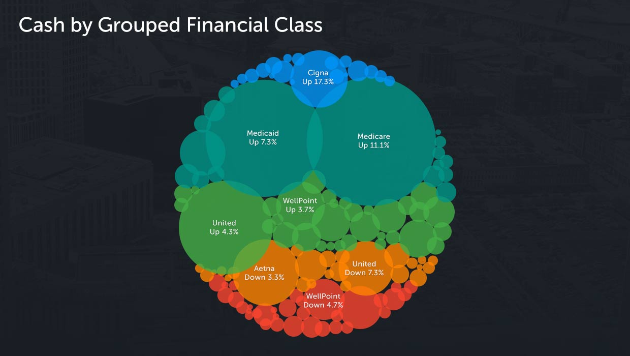
Cash Analytics
Our Cash Analytics solution provides advanced, highly intuitive insight into the sources of cash from payers by presenting visuals that go far beyond standard pie charts where insights can hide. Dynamic visualizations tell better data stories before users dive deep. An additional click into this visual brings cash flow from payer sources to life with streaming visuals and time-lapse techniques that better illustrate seasonality and other characteristics.
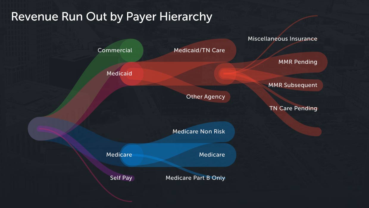
Revenue Run-Out Analytics
Revenue Run-Out Analytics illustrate how Gross and Net Revenue break down, and how expected net revenue is impacted by a variety of factors, from institutional payer sources to self-pay, denials, charity care and other administrative write-offs.
Geography & Location Analytics
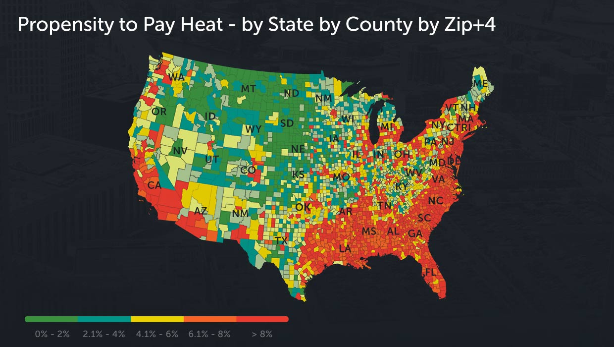
Geographic analytic visualizations provide rich insight by zip+4 into propensity-to-pay, charity, volume, demographic changes, clinical morbidities and mortalities, and hundreds of other key attributes and metrics. Advanced zoom-in features provide rich insight from 30,000 feet to street level views.
Advanced Worklisting
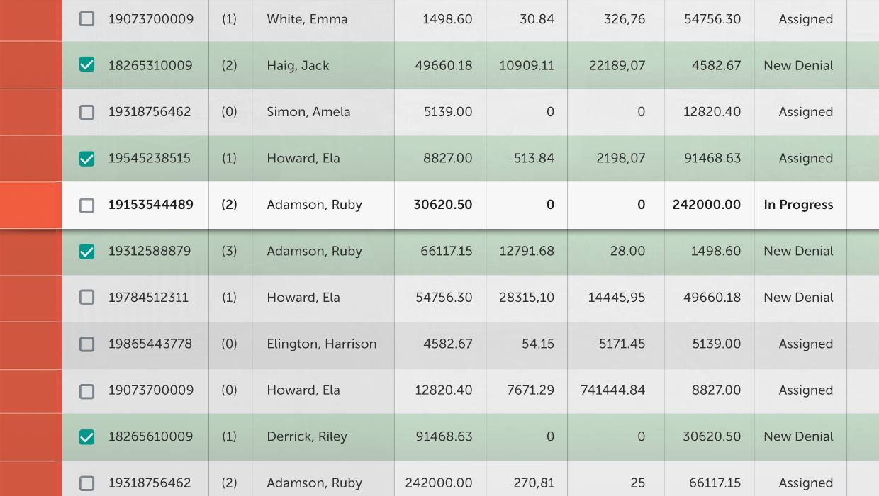
Advanced worklisting gives users an intuitive interface that lets them view data from multiple sources. Easy to use features and functionality include multi-user collaboration, dynamic statusing, flagging, and on-the-fly remark codes and other annotations. VisiQuate’s Card View features centralize all key information on patient and guarantor accounting into an easy and intuitive interface, which better enables action and account resolution.
© 2025 VisiQuate, Inc. All Rights Reserved.


